General
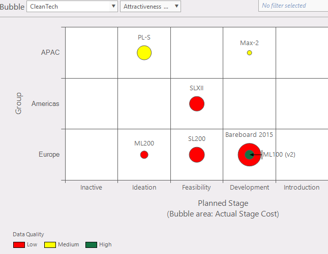
Figure 1: bubble graph
This function provides an overview of projects in a portfolio in a bubble graph. What's a bubble graph? The bubble adds an extra dimension to the graph. In the example shown (fig. 1) the size of the bubble is related to the "Actual stage cost".
Where to find
Task bar Portfolio > bubble.
Options:
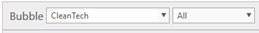 Active portfolio: (fig. 2) use drop down to change the active portfolio. Active portfolio: (fig. 2) use drop down to change the active portfolio. Filters: In this panel you can select which data will be plotted. Filters: In this panel you can select which data will be plotted. Configurationpanel: these can be used to select a custom view of the portfolio in the bubble graph (fig. 5). Select other entity (like project stage, cost or location) for the axis to present you're data in an understandable way. Configurationpanel: these can be used to select a custom view of the portfolio in the bubble graph (fig. 5). Select other entity (like project stage, cost or location) for the axis to present you're data in an understandable way.
- X-axis; (fig. 5)
- Y-axis; (fig. 5)
- Bubble area; The size of the circle
- Bubble color; Display this entity in a color
- Show name labels in diagram
- Show unused colors in legend; Example; if in figure 1 there would be no medium (yellow) bubble, the legend would not show the legend for "Medium".
- Show unselected projects; figure 1 doesn't show the unselected projects and figure 4 shows unselected projects. The white projects are part of the portfolio but not part of the composition.
- Fixed bubble area; Set max bubble size (in this example, when a value is over 1.190.000 it stays the maximum bubble size). When not checked the largest bubble is the largest value.
|
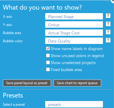
Figure 2: select condition
|

|
 Reload: refresh the bubble graph window. Reload: refresh the bubble graph window.- Hovering over a bubble (fig. 3): will give some information of that bubble.
- Selecting project from a bubble; by clicking on a project in a bubble.
|
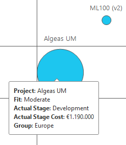
Figure 3: info by hovering over a bubble
|
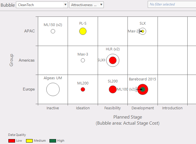
Figure 4: bubble graph with Show unselected projects
|
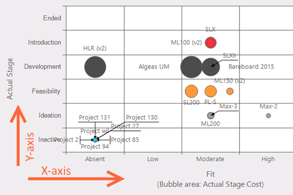
Figure 5: X- and Y-axis
|
|