General
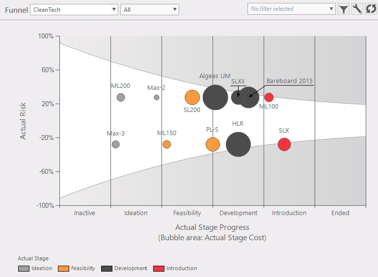
Figure 1: funnel graph
This function provides an overview of projects in a portfolio in a funnel graph. What's a funnel graph? This graph adds an extra dimension to the graph (like a bubble graph). In the example shown in figure 1 the size of the bubble is related to the "Actual stage cost". The funnel assumes that the later/older item will be closer to the average.
Where to find
Taskbar Portfolio > funnel
Options:
 Active portfolio: shows initial portfolio and chance the active portfolio Active portfolio: shows initial portfolio and chance the active portfolio Filters: these can be used to select a custom view of the portfolio in a funnel graph. Filters: these can be used to select a custom view of the portfolio in a funnel graph.
 Configuration: in this panel you can select which data will be plotted (fig. 4). Configuration: in this panel you can select which data will be plotted (fig. 4).
- X-axis; (fig. 6)
- Y-axis; (fig. 6)
- Bubble area; The size of the circle
- Bubble color; Display this entity in a color (example fig.1)
- Show name labels in diagram.
- Show unused colors in legend; Example; if in figure 1 there would be no medium (yellow) bubble, the legend would not show the legend for "Medium".
|
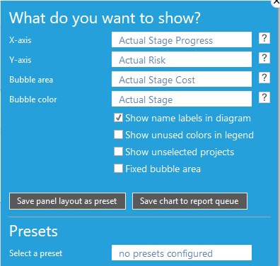
Figure 2: select condition
|
- Show unselected projects; figure 1 doesn't show the unselected projects and figure 4 shows unselected projects. The white projects are part of the portfolio but not part of the composition.
- Fixed bubble area; Set max bubble size (in this example, when a value is over 1.190.000 it stays the maximum bubble size). When not checked the largest bubble is the largest value.

Figure 3: fixed bubble area
 Reload: refreshes the bubble graph window Reload: refreshes the bubble graph window
|
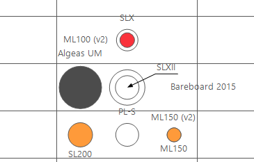
Figure 4: show unselected project (white)
|
- Hovering over a bubble (fig. 5): this will give some information of that bubble.
- Selecting project from a bubble; by clicking on a project in a bubble
|
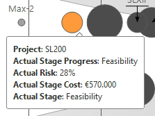
Figure 5: info by hovering over a bubble
|
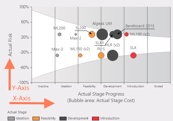
Figure 6: X- and Y-Axis
Note
In fact there is no negative risk but to present a more readable graph bubbles are evenly spread on positive and negative risk axis.
|