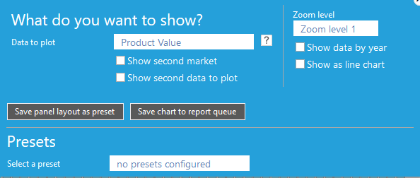
- Data to plot; choose data to plot on the y-axis from dropdown menu.
|
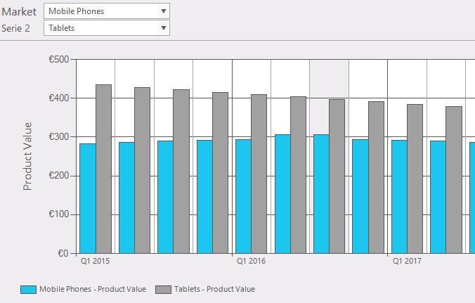
- Show second market; add a second market in your graph to compare (fig. 3)
|
- Show second data to plot;
|
- Data to plot 2; choose data to plot on the y-axis from dropdown menu
|
- Zoom level; select time window to plot (zoom level1, zoom level2, zoom level3). These levels can be set in system settings (Administration >> system settings >> view).
|
- Show data by year; (plot time on x-axis in years or quarters)
|
- Show as line chart; (fig. 3); instead of a bar graph plot it in a line graph.
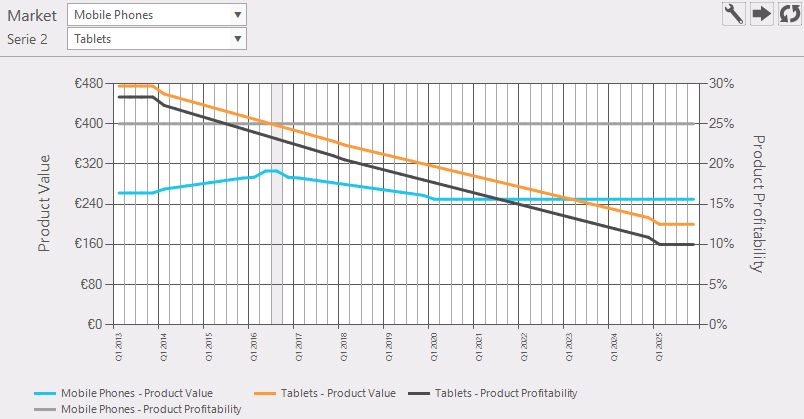
Figure 3: Example of a market over time as line graph, second market and second data to plot
|
- Save panel layout as preset; Save these settings
|
|
- Save chart to report queue; set this chart ready to use it in a report.
|
- Select a preset; get a predefined preset.
|
|
- Hovering over a graph (fig. 4): this will give some information of that item.
|
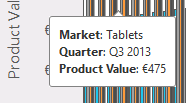
Figure 4: info by hovering over the graph
|
 Export data Export data
|
|
 Reload: refreshes the window. Reload: refreshes the window.
|
|