General
This function provides an overview of versions per projects in a bubble graph. What's a bubble graph? This graph adds an extra dimension to the graph. In the example shown in figure 1 the size of the bubble is related to the "Actual stage cost".
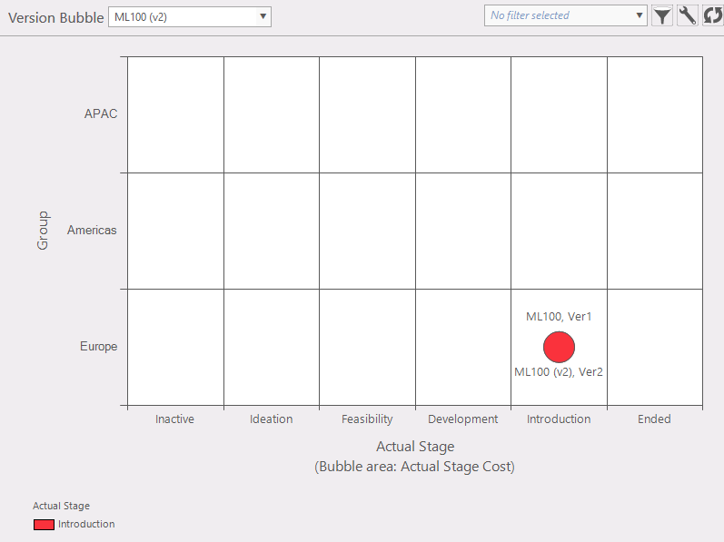
Figure 1: example version bubble graph
Where to find
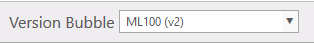
Taskbar Project >> version bubble.
Options:
- Active portfolio:
 shows initial project and change the active project. shows initial project and change the active project.
 Filters: Filter the project selection list. Filters: Filter the project selection list. Configurationpanel: in this panel you can select which data will be plotted (fig. 2). Configurationpanel: in this panel you can select which data will be plotted (fig. 2).
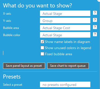
Figure 2: select condition
- X-axis; select data which will be plotted on the X-axis (fig. 3)
- Y-axis; select data which will be plotted on the Y-axis (fig. 3)
|
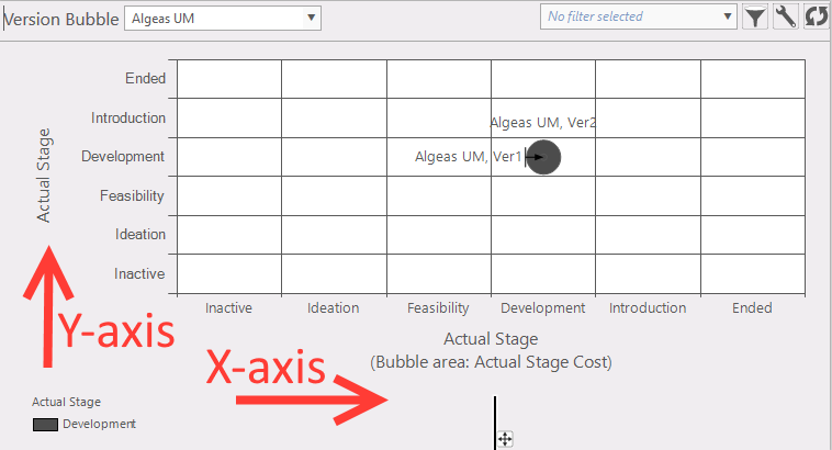
Figure 3: select condition
|
- Bubble area; select data which will be plotted as size of the bubble.
- Bubble color; select data which will be plotted as the color of the bubble.
- Show name labels in diagram; Bubbles with or without project names.
- Show unused colors in legend;
- Fixed bubble area; when not set the highest value for a bubble is also the largest (set) size of that bubble. When the boundaries are set, the size of a bubble will be small as the value is equal or less as the set minimum. And the size of a bubble will be large (fixed size) as the value is equal or larger as the set maximum. In between the boundaries the size will be proportional to its value.
- Save panel layout as preset;
- Save chart to report queue; make this chart ready to be used in a report.
- Hovering over a bubble (fig. 3): this will give some information of that bubble.
- Selecting project from a bubble; by clicking on a project in a bubble.
|
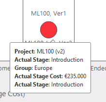
Figure 3: info by hovering over a bubble
|
Note
In the overview it's possible to go to the project in the list. To do that, click on the project bubble.
|