General
This function provides an overview of value in a project in an over time graph. Values can be plotted in a graph on a time base of quarters or years.
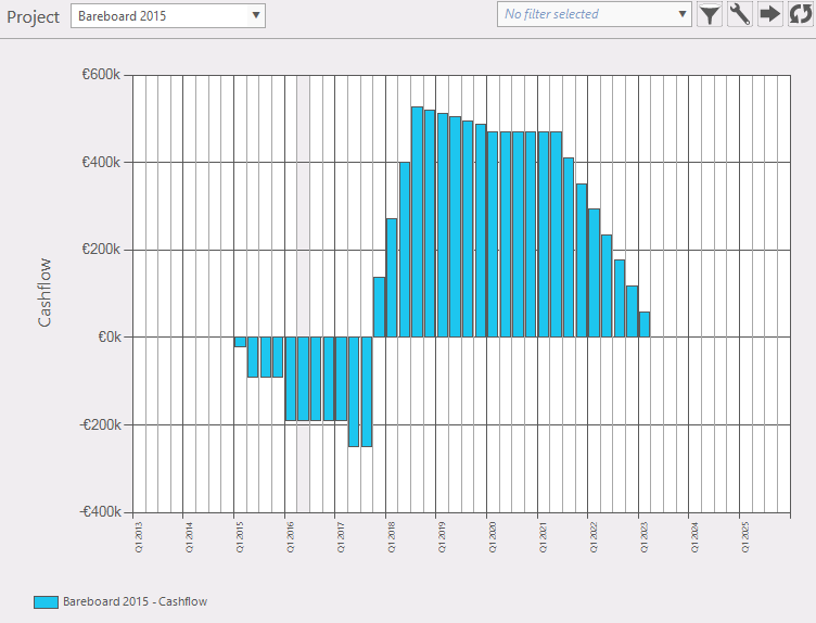
Figure 1: example over time graph
Where to find
Taskbar Portfolio >> portfolio over time.
Options:
- Active portfolio:
 shows initial project and changes to the active project. shows initial project and changes to the active project.
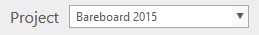
 Filters: Filter the project selection list. Filters: Filter the project selection list. Configuration panel: in this panel you can select which data will be plotted (fig. 2). Configuration panel: in this panel you can select which data will be plotted (fig. 2).
Figure 2: select preset conditions
After you have selected the desired data, your selection can be saved as a panel preset. Options to select:
- Data to plot; choose data to plot on the y-axis from dropdown menu
|
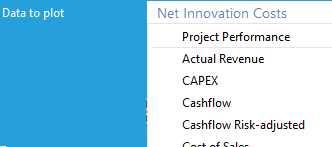
Figure 3: info by hovering over a bar
|
- Show second project; add another project to compare (fig. 4)
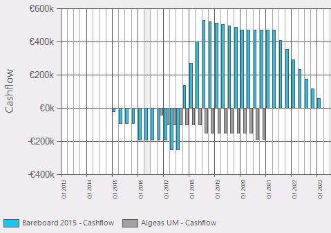
Figure 4: show second project in the graph
- Zoom level; select time window to plot (zoom level1, zoom level2, zoom level3). These levels can be set in system settings (Administration >> system settings >> view).
- Show data by year; (plot time on x-axis in years or quarters)
- Show as line graph; (fig. 5); instead of a bar graph plot it in a line graph.
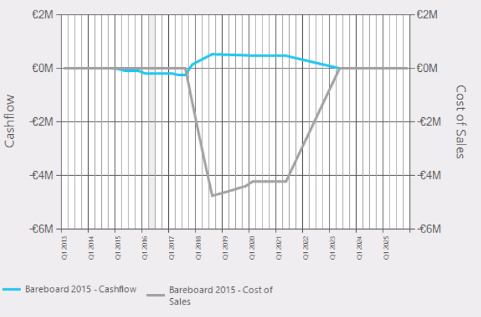
Figure 5: plot data in a line graph.
 Export data Export data  Reload: refreshes the window. Reload: refreshes the window.
- Hovering over a graph (fig. 6): this will give some information of that item.
|
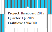
Figure 6: info by hovering over a bar
|
Note
More information about constraints is found at the Flightmap website: use case: Optimization
|