- Settings
 Will give several options to change the way the graph is represented (fig. 2). Will give several options to change the way the graph is represented (fig. 2).
Depending on the data you want to plot and the settings you make, the offered options can differ (fig. 3).
For example: when the option Stacked by project is chosen, the option Show as pie chart will disappear, because this is not a supported feature
You can save a set of settings as a panel preset. Selecting the preset will restore the set of settings and plot the graph accordingly.
|
Figure 2: select condition
Figure 3: different selection options
|
- Data to plot (fig. 4)
Choose data to plot on the X-axis from first dropdown menu and the second dropdown menu will be on the Y-axis.
|
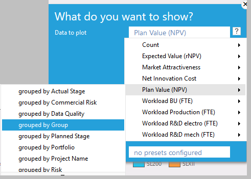
Figure 4: Select data you to plot. In this case Plan value (x-axis) by group (Y-axis)
|
- Stacked by project
Stacked bars show details on project level (fig. 1). Unstacked bars show the aggregate grouped values (fig. 5).
|
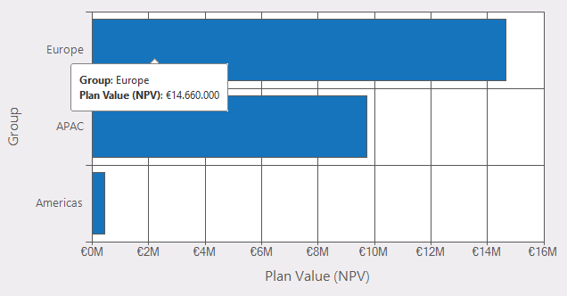
Figure 5: graph not stacked
|
- Sort groups alphabetically
When checked, the groups will be plotted in alphabetical order.
|
|
- Show as Pie chart (fig. 6)
When checked, the data are plotted as a pie chart. This option is not available for relative values and when the option Stacked by project is checked.
Furthermore, a pie chart cannot be plotted in case of negative values.
|
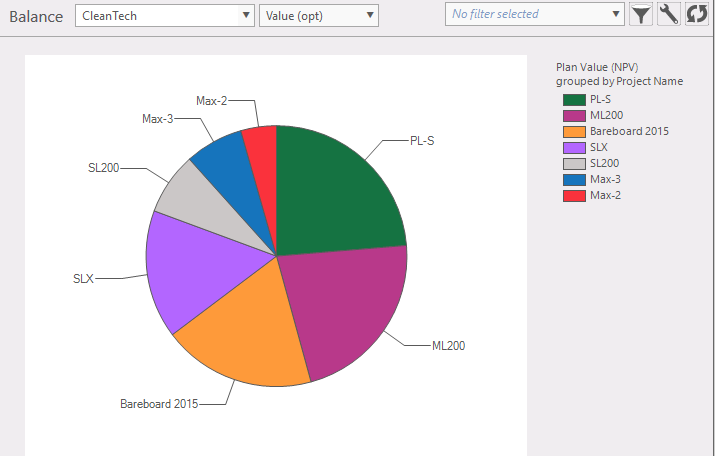
Figure 6: the graph can also be set as a pie chart
|
- Show constraints (fig. 7)
This adds an indication of a preferred amount to the data plotted. Constraints are defined in the portfolio data.
|
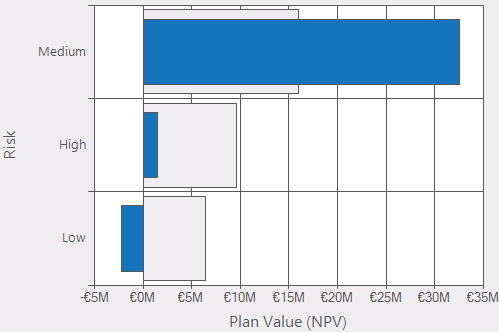
Figure 7: this graph shows the constraint of a 50%, 30% and 20%
|
- Differentiate by color in bar chart (fig. 8)
When checked, every bar will have a different color, like in figure 6.
- Show unused groups (fig. 8)
When checked, groups that are not in the selection will also be plotted.
|
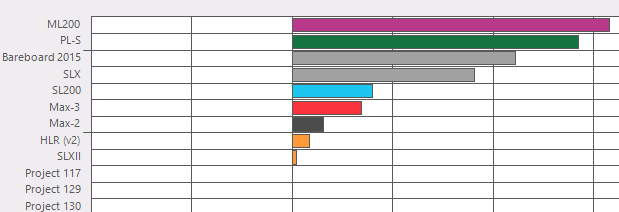
Figure 8: differentiated colors, show unused groups. e.g. Projects 117, 129 are not used
|